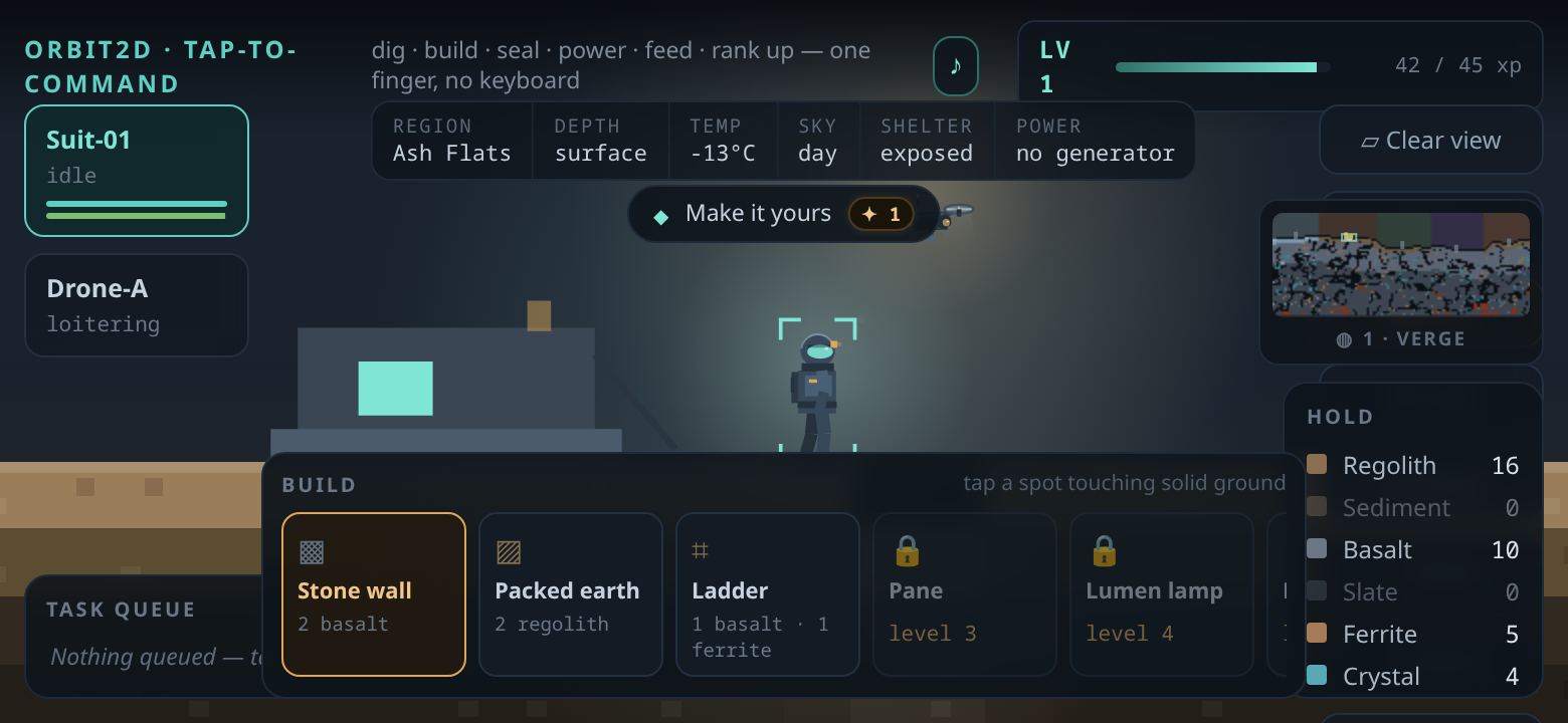
A player sent in a screenshot from their phone, held sideways, with a note that said: the HUD is in
the way of the tools. They were right, and the screenshot was worse than the description. The build
tray, the hold and the survey map were all sitting on top of each other, and between them they were
covering most of the ground you are supposed to be tapping.
The wrong question
The layout had a phone mode and a desktop mode, and it chose between them by asking how wide the
screen was. Anything under 720 pixels got the compact HUD. That works for a phone held upright. A
phone held sideways is about 780 pixels wide and 360 tall, so it sailed past the test and got the
full desktop layout — panels sized for a laptop, stacked into a strip of screen no taller than a
bus ticket. Seven toolbar buttons in a single column ran off the bottom. The hold panel and the
survey map, positioned relative to the viewport height, landed on top of each other.
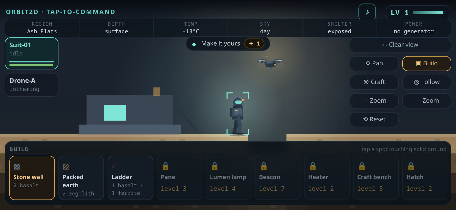
Width was never the right question. The thing that makes a HUD crowd the play area is height. So
there is now a second breakpoint that asks how tall the viewport is, and anything under 560 pixels
gets its own layout: the toolbar folds into two columns, the environment strip stretches edge to edge
in smaller type, the crew cards and build tiles shrink, the hold moves left of the survey map instead
of on top of it, and in build or craft mode the hold, the queue and the map get out of the way
entirely.
Clear view
Tidier panels are still panels. Sometimes you want to see the rock, and no amount of careful
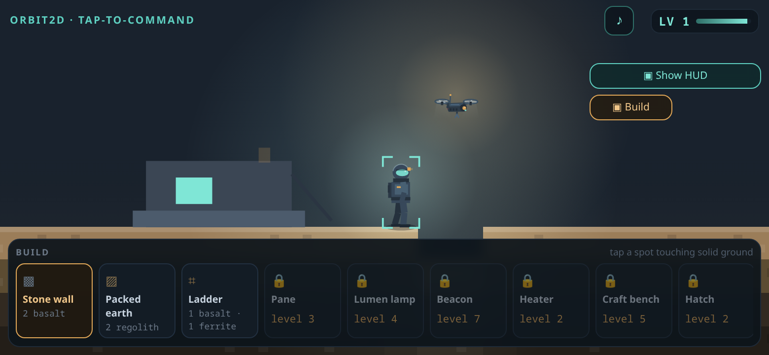
positioning gives you that. So there is a new button at the top of the toolbar on every device:
Clear view. One tap folds away the crew cards, the environment strip, the objective,
the queue, the hold, the survey map and the rest of the toolbar. What stays is the world, the build
tray if you are building, and one button to bring it all back. It remembers your choice, because
somebody who wants a clear view today wants one tomorrow.
The tutorial strip along the bottom also learned some manners. It used to sit there for the whole
session; it now fades out the moment you give your first order, or after thirty seconds if you are
still reading it.
Live now at orbit2d.co as v0.10.1, and in the Android build on
the download page. If something on your screen is in the way
of something else on your screen, please keep sending the screenshots — a layout bug is invisible to
the person who wrote the layout on the device they wrote it on.
Leave a Reply